So for our 5th project we're to make a packaged 3d model of our redesign on a product of our choosing. I decided to choose the cereal brand "Krave", I felt like it could use a more comical and playful design to match the commercials.
Still working on it, though I feel like the time constraints will have me working at the cmc to finish it up in time.
Sunday, December 1, 2013
Catch Up: Project 4
I'll put up an image when I come back to edit this. For our 4th project we were tasked with creating a book cover from a list of books. When I looked over the list, only 1 title caught my eye, "To Kill a Mockingbird". The reason being is that it was required reading for me back in middle school; having read the book twice and seen the movie once, I figured it would be easy to make an appropriately themed cover for the book. Of course my memory was fuzzy so I had to go look into sparknotes to refresh my mind a bit.
Sunday, November 17, 2013
Catch Up: Project 3

First of all this is a bad scan/image of my project 3, it is WAY LIGHTER, than here. For project 3, we had to make a poster for an event of our choosing. It was pretty fun considering we had no limitations, but the constant "quick turn arounds" kinda caught up to me and I ended up turning it in a day late.
My event of choice was the Harbin Snow Festival in China, which is one of the 3 biggest snow festivals in the world (the other 2 being in Japan and Canada). I pulled up actual ice scultptures and went crazy with the pen tool and tracing them. I decided right away that a lightish blue color scheme would capture the "icy" feel that I want my poster to convey. The background were icicles traced and the white space also resembled icicles, which was a pleasant surprise. I wanted to put a heavy emphasis on opacity to try and make my images clear and transparent; like ice. The text were dark blue in order to stand out and with the title I kept it at black with a light blue border; to try and show the text being "frozen".
Catch Up: Project 2


So...project 2, we had the pleasure of being tasked to make ads for a company of our choosing. Initially as I've said before in one of my older posts, I wanted to do something for a video game company. But most of those companies already have recognizable characters/franchises, that it would be difficult for me to create a great ad for them without it being too..."overdone".
So I chose Best Buy, something close, but not exactly.
I decided to base the 3 ads on products they sell that aren't as "well-known". When you think of Best Buy, you think of electronics such as computers and possibly printers. I focused on applicances, dvds, and video games. I wanted something to "tie in" all 3 ads, so I created a blue background, which also gave me the chance of adding in text without the image taking it over. The blue background also compliments the best buy logo (yellow on blue stands out).
Initially, I looked up their slogans and the "great prices, no pressure" pretty much set what my ads' theme would be "pressure".
The t-rex one was the first one that came to mind; cue an employee with a t-rex head heading towards you. The fridge at the very top was more of a last minute call; I needed something to fit that size/dimensions so I decided to crop the original image and try to make it bigger than it seems, with the silhouette being there just to show scale...like a fridge falling on you...or something.
The last one was my favorite, I never played COD, but it was the first that came to mind when I needed a popular video game to get a game ad covered. The top probably could have just been left as a blue border and my only regret was that I actually pursued "gluing" all those sales in there, even though it just clogged up the ad.
Catch Up: Project 1
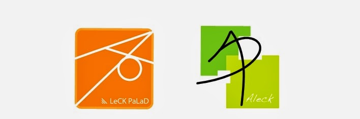
Bit overdue, but here's what I did for my first project. We were tasked with making 2 logos (after alot of sketching and elimination of earlier ideas). I wanted to go with something simple, something minimal but still gets the point across. The symbol pretty much originated from when I was trying to combine my initials. At some point it looked like a kite and that's where the square border came in.
In my previous projects I went with the orange one, it was the last idea I came up with, but was the one I was pleased with the most. Orange isn't really my favorite color, but it's very vibrant. Something that I had in mind when I was making these logos. I wanted them to resemble iphone apps.
Thursday, October 31, 2013
Proj 4 Choice
Scrolled through the list of books that our class could choose from and was delighted to find a title that I could recognize.

I remember reading this book twice in 2 different grades (middle school) and even watching the movie one time. I heard they were doing a remake of it, but I never looked into it other than the commercial previews.
Not sure how I'd start working on a cover for it though, if you've read the book you'll already know that the cover above is just overflowing with symbolism from the book. Maybe a scene from the book might work better...though the title contrast with the scene might make things awkward.
----
Will also get around to posting my 3 previous projects as a means of getting caught up later on.
Thursday, September 26, 2013
Good Ads Bad Ads
Two things that I look at when I see ads are creativity and message. Both of these define what makes an ad successful or a failure.
Note that these are based on my opinion:
THE GOOD:

This one is from at&t, and this isn't the only one they have of this. They actually expanded the idea to other "similarly themed" ads. One with China and the Great Wall, another with India and elephants, etc.
Creativity - The usage of hands as the base of the forms and the variety of ads they made using this method is staggering (in a good way). A variety of color schemes for each "version" of this ad gives each one a sense of identity (it can stand alone on it's own), while still being unified by the basic idea (usage of hands).
Message - The idea is that their reach is world wide, being evidenced by the fact that they have multiple ads. Really leaves a lasting impression that can reach out to a wide audience.
THE BAD:
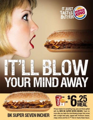
Why Burger King! Whyyyyy?!?!?
At first I couldn't believe it, "that can't be the idea behind this, it must be something else!". Yes folks the ad is one big innuendo.
Creativity - It reminds me of those overused "that's what she said" jokes. I find it still interesting and the design is well done, but the concept kinda just blows that out of the water. All you could focus on is...
Message - I found this image under "sexist ads". Not good, you want your ads to be perceived positively, something like this would turn certain people away, which limits your ads' potential. While I might find it lulzy, that's not really the case for everyone. They really wanted to push the innuendo through with:
- "It'll BLOW your mind away"
- "BK Super SEVEN INCHER"
Subscribe to:
Posts (Atom)