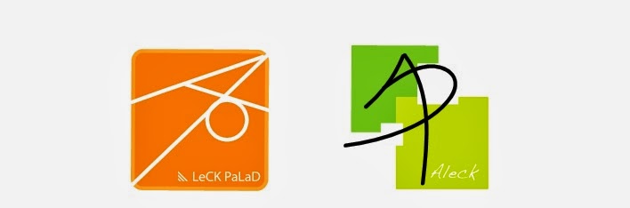
Bit overdue, but here's what I did for my first project. We were tasked with making 2 logos (after alot of sketching and elimination of earlier ideas). I wanted to go with something simple, something minimal but still gets the point across. The symbol pretty much originated from when I was trying to combine my initials. At some point it looked like a kite and that's where the square border came in.
In my previous projects I went with the orange one, it was the last idea I came up with, but was the one I was pleased with the most. Orange isn't really my favorite color, but it's very vibrant. Something that I had in mind when I was making these logos. I wanted them to resemble iphone apps.
No comments:
Post a Comment