Two things that I look at when I see ads are creativity and message. Both of these define what makes an ad successful or a failure.
Note that these are based on my opinion:
THE GOOD:

This one is from at&t, and this isn't the only one they have of this. They actually expanded the idea to other "similarly themed" ads. One with China and the Great Wall, another with India and elephants, etc.
Creativity - The usage of hands as the base of the forms and the variety of ads they made using this method is staggering (in a good way). A variety of color schemes for each "version" of this ad gives each one a sense of identity (it can stand alone on it's own), while still being unified by the basic idea (usage of hands).
Message - The idea is that their reach is world wide, being evidenced by the fact that they have multiple ads. Really leaves a lasting impression that can reach out to a wide audience.
THE BAD:
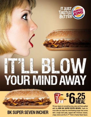
Why Burger King! Whyyyyy?!?!?
At first I couldn't believe it, "that can't be the idea behind this, it must be something else!". Yes folks the ad is one big innuendo.
Creativity - It reminds me of those overused "that's what she said" jokes. I find it still interesting and the design is well done, but the concept kinda just blows that out of the water. All you could focus on is...
Message - I found this image under "sexist ads". Not good, you want your ads to be perceived positively, something like this would turn certain people away, which limits your ads' potential. While I might find it lulzy, that's not really the case for everyone. They really wanted to push the innuendo through with:
- "It'll BLOW your mind away"
- "BK Super SEVEN INCHER"
No comments:
Post a Comment